TikTok
Partnership:
Data analytics through intuitive UI
Name: Mavrck Influencer Marketing Platform
Info: The challenge: To visualize the 3 data sources about an influencer’s audience (All socials, TikTok Specific, Instagram Specific)
TikTok Partnership: Data analytics through intuitive UI
Name: Mavrck Influencer Marketing Platform
Info: The challenge: To visualize the 3 data sources about an influencer’s audience (All socials, TikTok Specific, Instagram Specific)
Overview
Enabling brands to run TikTok campaigns with TikTok creators:
1. Brands need to be able to filter and search for TikTok creators
2. Brands need to see a creator’s TikTok audience insights
The Problems
Brands could not search for TikTok creators and did not have access to their TikTok audience insights, which reduced campaign execution rate
The Goal
To drive the campaign execution rate by unlocking new insights for our users
My Role
• UX
• UI
• Researcher
Stakeholders
• TikTok Business Team
• Mavrck Business Team
The Process
The Process
How it started
We partnered with TikTok and their new creator market place. In order for brands to run campaigns with TikTok creators, we needed to enable them to search them and see their TikTok audience insights.
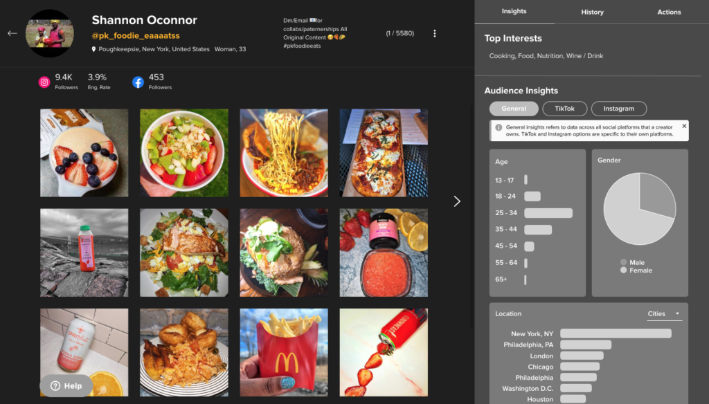
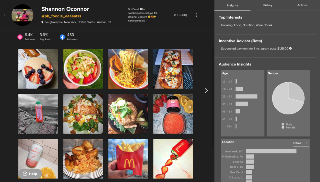
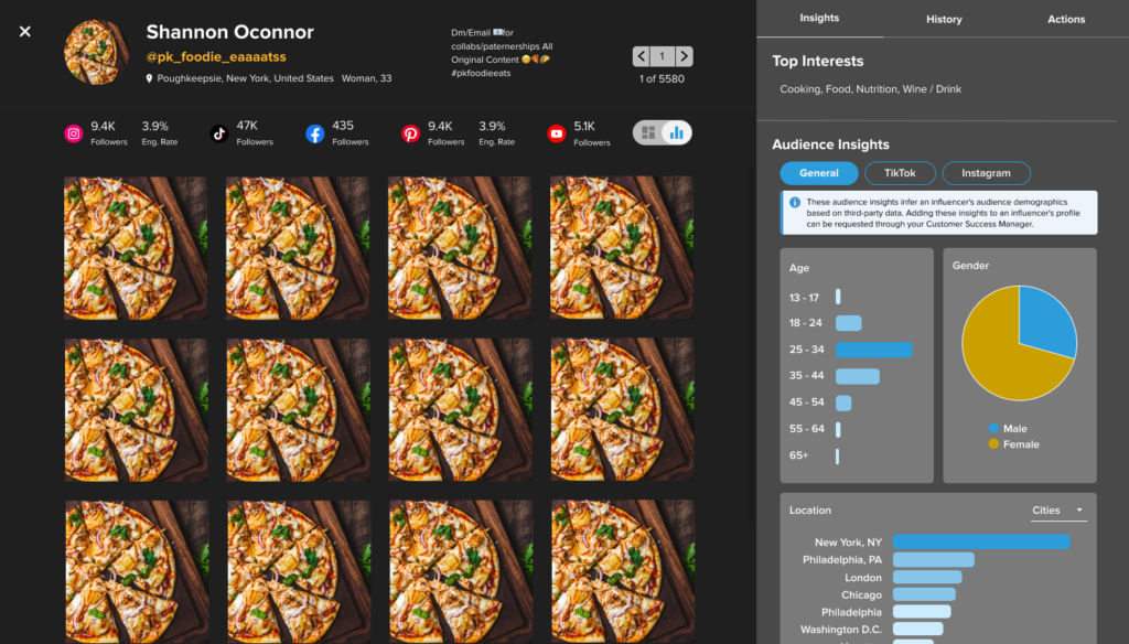
Initially, I designed a first iteration of incorporating the TikTok audience insights into data visualization.
Getting feedback from the team
Main feedback I received from the design team were to add color to increase usability.
Validate problems, solution & get feedback from users
Since we partnered with TikTok, we had over $1M worth of new campaigns lined up of brands wanting to work with us.
With this, we needed to enable users to filter by TikTok creators and also show TikTok specific insights in the data visualization of a creator.
At the same time, while we were going to make updates to this view, I wanted to identify if there were any low effort/high impact problems to solve for while I designed for this feature update.
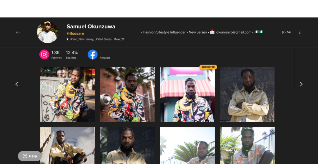
The problem that stood out was many users did not know to click on the 3 dots on the top right to see “more insights”
User feedback on solution
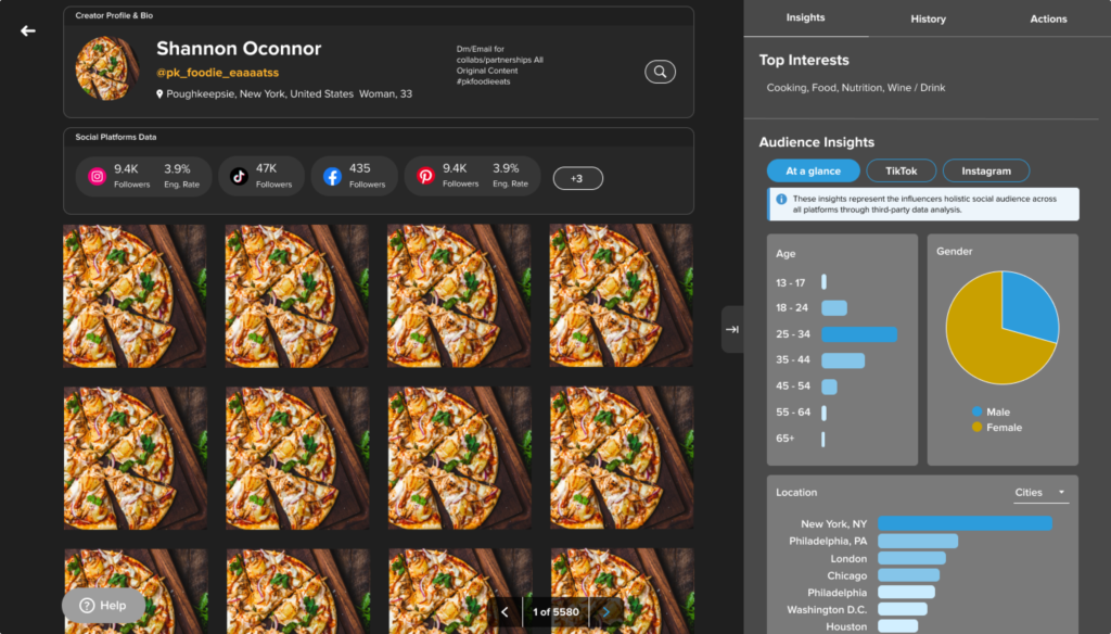
• "Easier to read"
• "Looks more modern and up to date"
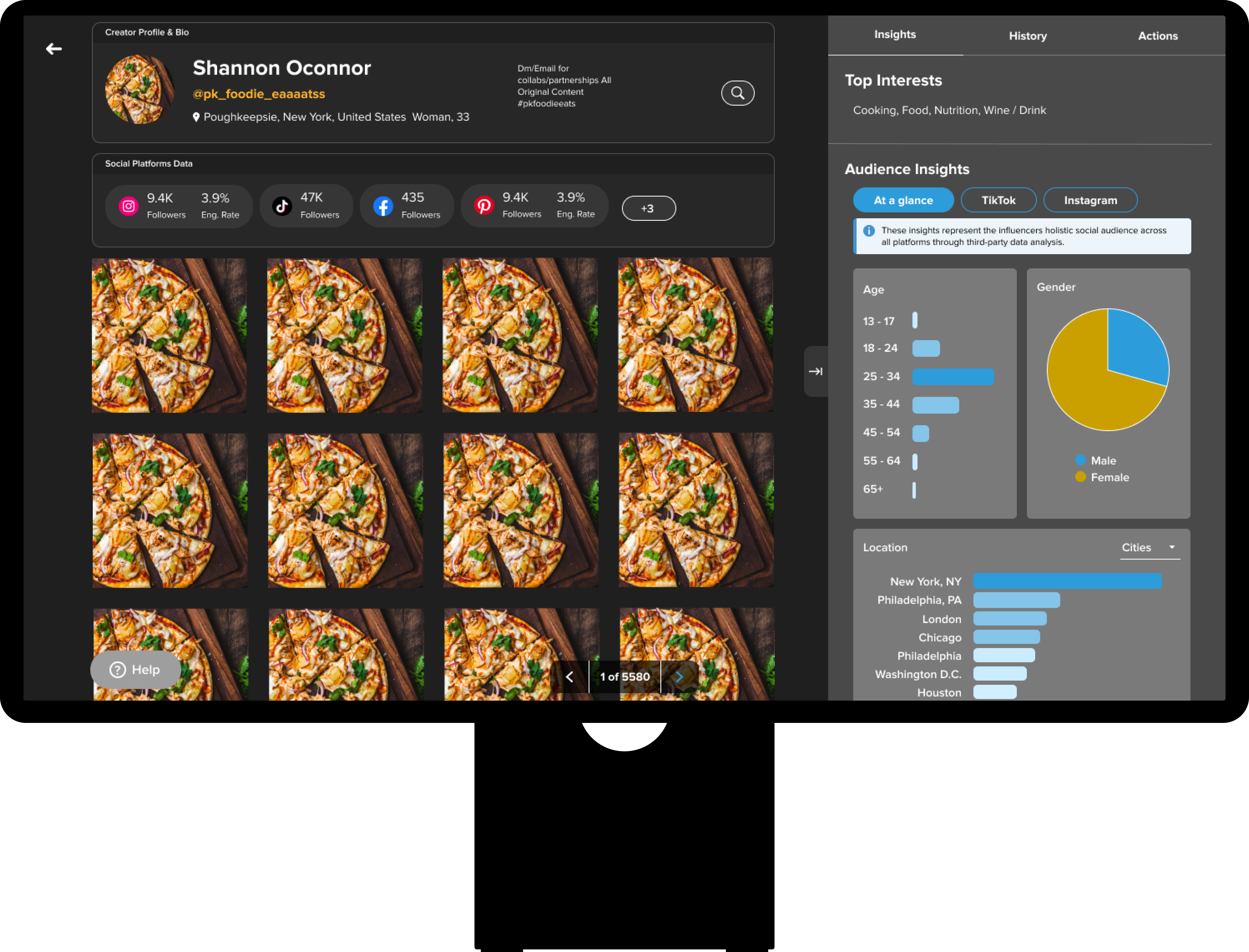
Make new iterations and finalize
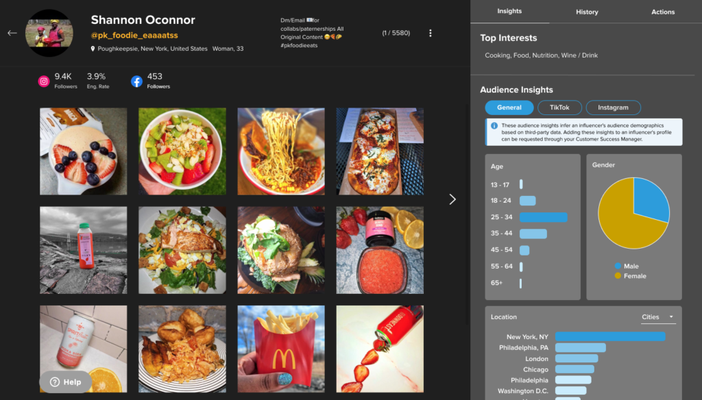
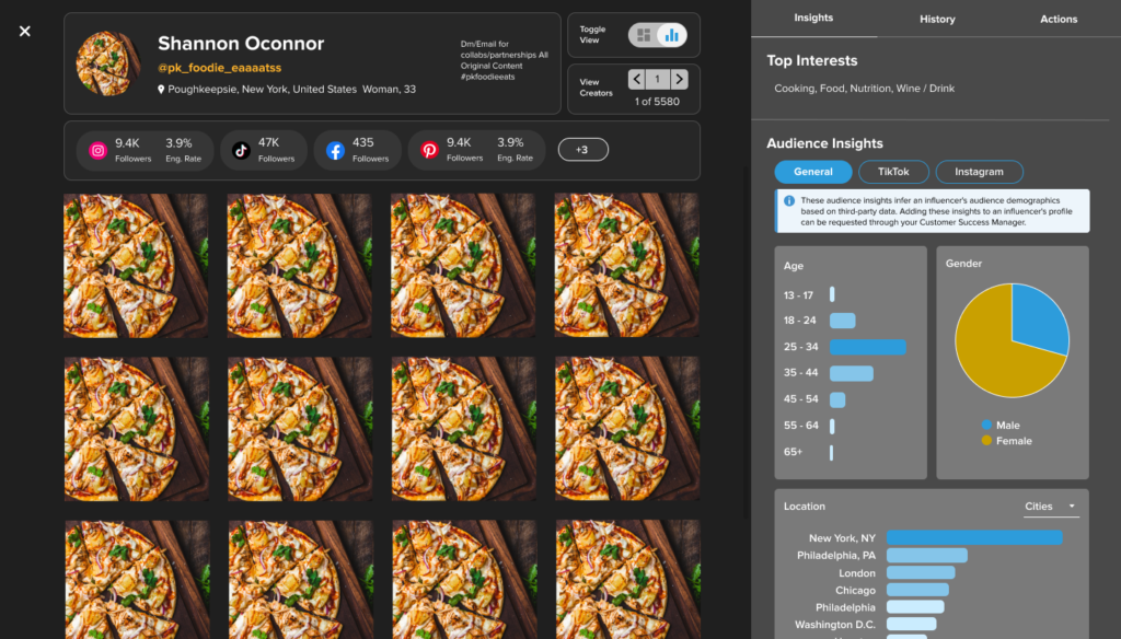
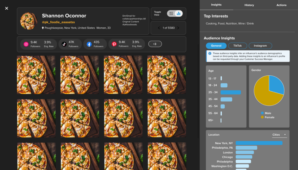
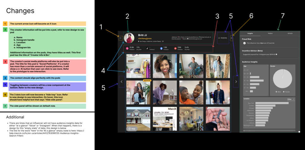
There were usability updates I made to the data visualization to make it easier for users to digest the insights
Some include: color, rounded borders, and common region for groups of information.
Validate the solution again
- 3 of 5 users rated a 4/5 for intuitiveness
- 2 of 5 users rated 5/5 for intuitiveness
- The feedback for ⅘ was related to the content on the left (which is not in this scope to fix) and also wording of the pill buttons
Groom with engineers
Discussed new changes step by step with engineering, and had QA on the call as well as an extra eye when QA also does their own tests
Visual/Design QA
Iteratively collaborated with engineers while they completed milestones of this feature and released into the testing environment
Measuring Impact
Our north star metric is new campaigns run by clients/brands because it directly correlates to revenue.
Highest usage of the “lightbox” view (which is the data visualization for an influencers insights) within the last year
43% more campaigns being run after release of this feature
39% more creators invited to partake in influencer marketing campaigns
Explore more
