Total Talus
3D printed surgical product
Purpose is to design and develop a website to introduce a new FDA approved surgery for patients who are suffering from bone tissue ankle disease
Designed and developed a website for 3D printed healthcare devices (acquired)
Name: Total Talus Replacement
Info: To introduce a new FDA approved surgery for patients suffering from death of the bone tissue in their ankles

Total Talus Replacement
Website Design to introduce new FDA approved surgery for patients suffering from death of the bone tissue in their ankles.

Overview
A previous client requested another website, this time for a 3D printed surgical implant
The Problem
Unable to communicate this new treatment with surgeons at the orthopedics conference in a month
Client's Goal
To share this new treatment with surgeons and get them interested in using it for their patients
Timeline
1 month
Share Worthy
The product became FDA approved a few months after the site launched and then the company got acquired by Paragon28
My Role
UI, UX, Developer
Stakeholders
Director of Marketing, Legal/Regulatory team, CAD Engineer, Researcher
The Process
The Process
Identifying Business Goals
After receiving an email to build another website, my next step was to hop on a discovery call with the client. Typically with websites, there are a few main questions that I ask to get started.
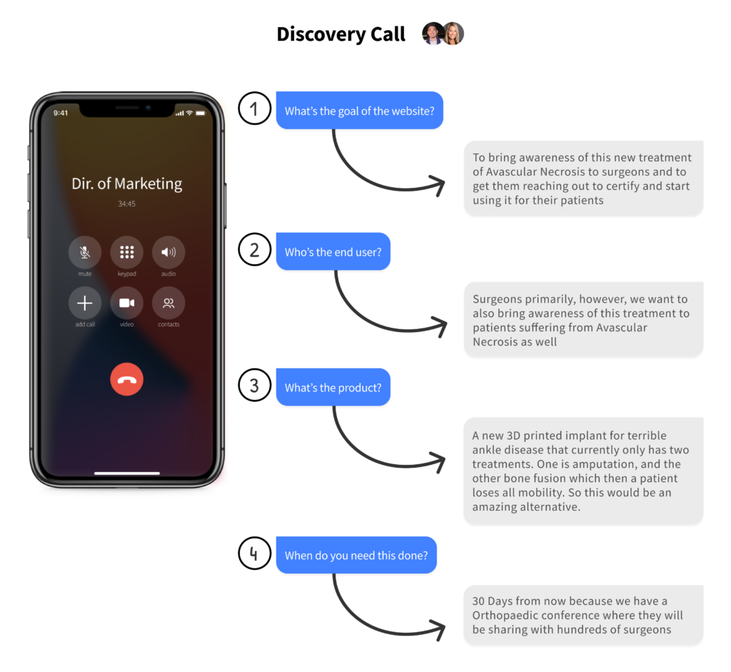
Main questions
1. What's the goal of the website?
2. Who's the end user?
3. What's the product?
4. When do you need this launched?
Answers to these questions:
1. To bring awareness of this new treatment of Avascular Necrosis to surgeons and to get them reaching out to certify and start using it for their patients
2. Surgeons primarily, however, we want to also bring awareness of this treatment to patients suffering from Avascular Necrosis as well
3. A new 3D printed implant for terrible ankle disease that currently only has two treatments. One is amputation, and the other bone fusion which then a patient loses all mobility. So this would be an amazing alternative.
4. 30 Days from now because we have a Orthopaedic conference where they will be sharing with hundreds of surgeons
Coming up with a solution
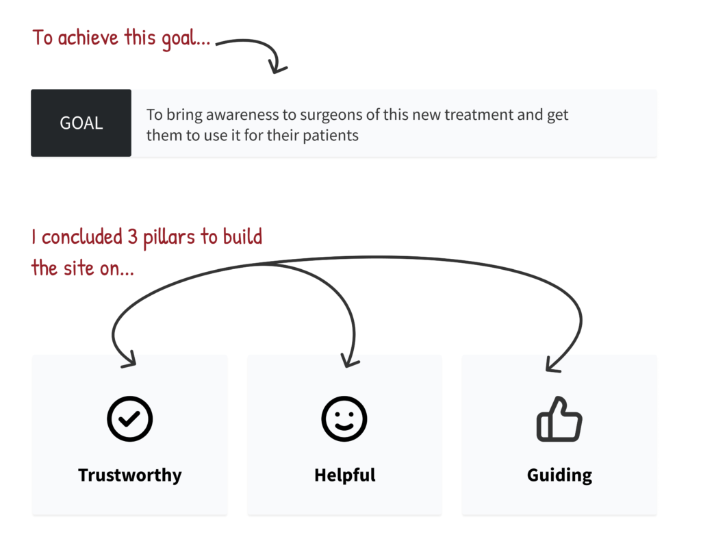
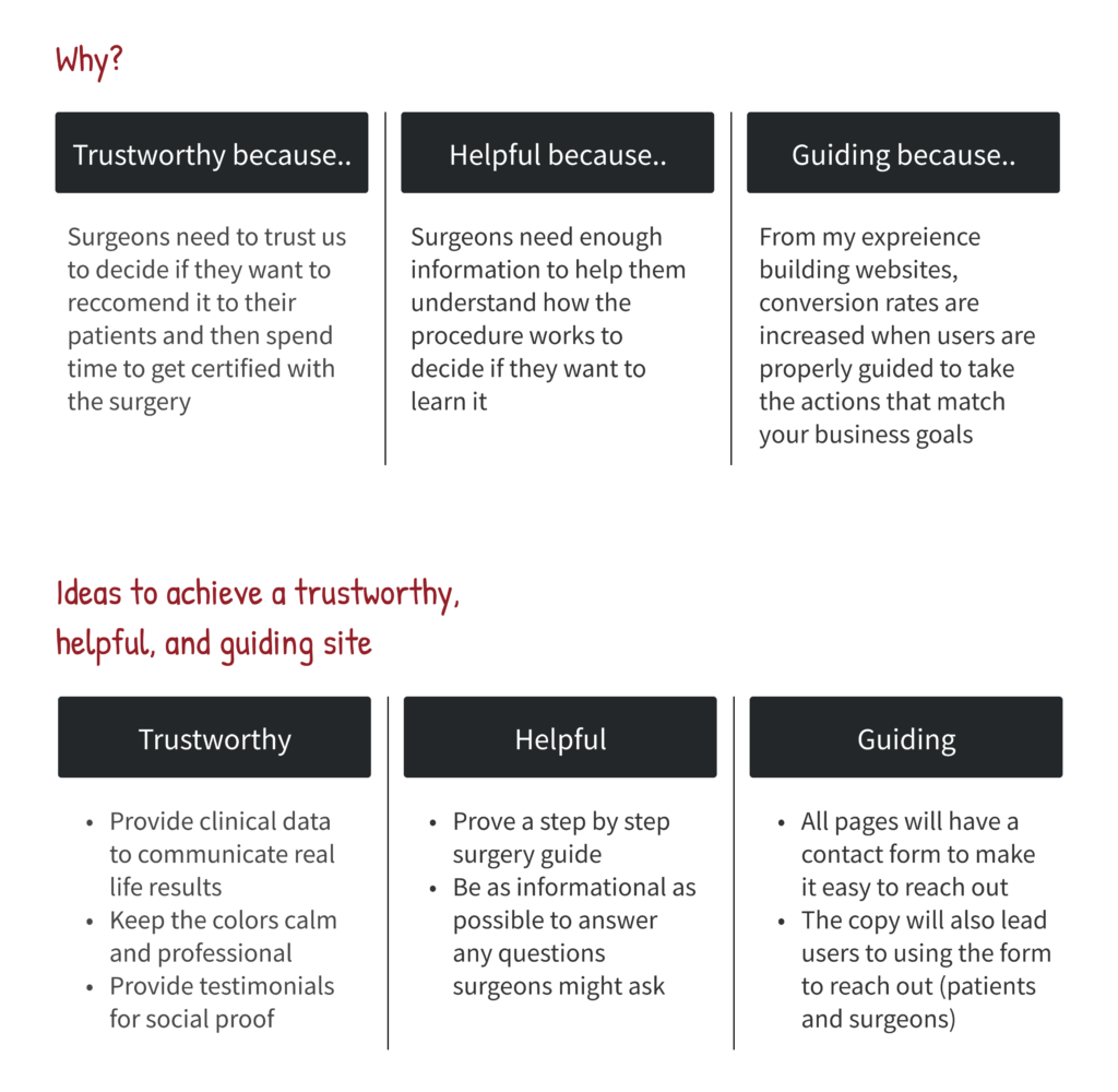
Now that we have the info we need to build the site. I concluded that the site needs to be trustworthy, informational, and help end users reach out to Additive Orthopaedics for the procedure.
- I decided trustworthy would be a pillar because this is a big deal for patients. They’re making a huge decision that replaces the talus bone in their ankle region.
- Informational because although this surgery is a better alternative to amputation or bone fusion, they still need to talk about it with friends, family, and their doctor to make a well-informed decision on the new alternative.
- From my experience building websites, users will not take an action on a website unless they are guided or asked to. If we don’t design the copy and layout of the site to help end users reach out to Additive Orthopaedics, they likely won’t do so.
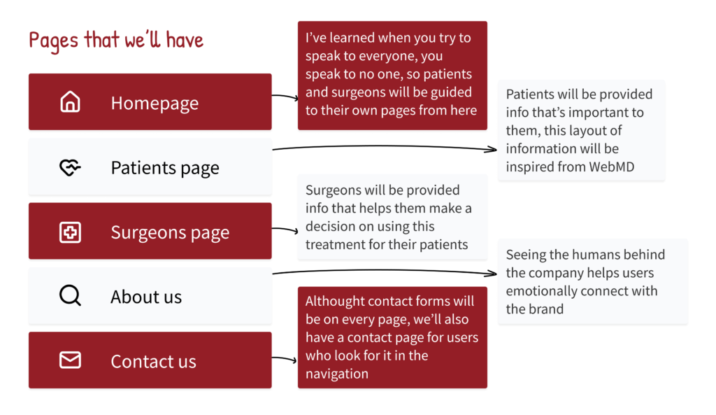
With all that being said, I came up with the pages that will achieve the clients needs as an MLP (minimum loveable product) since it’s a short time frame.
From my experience building landing pages that convert, when you try to speak to everyone, you end up speaking to no one because the messages are personalized enough.
Because of this, I decided we would have 5 pages.
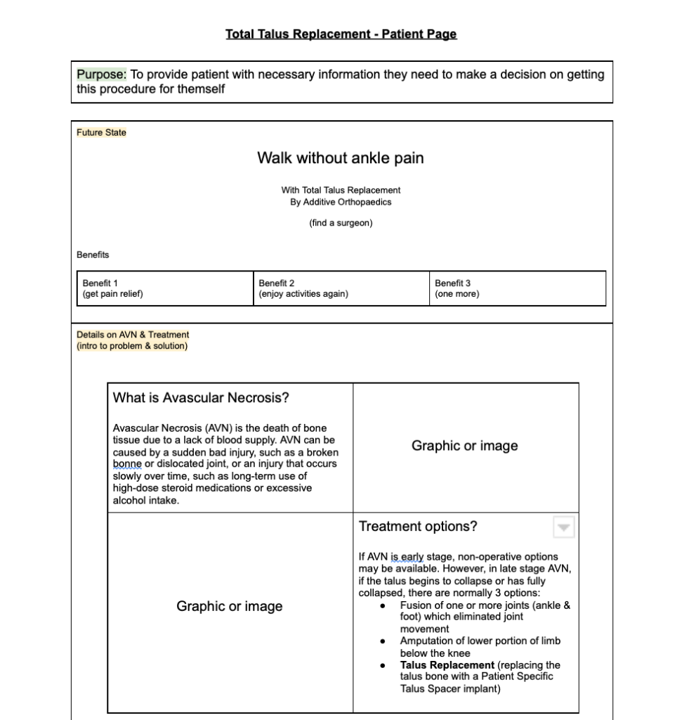
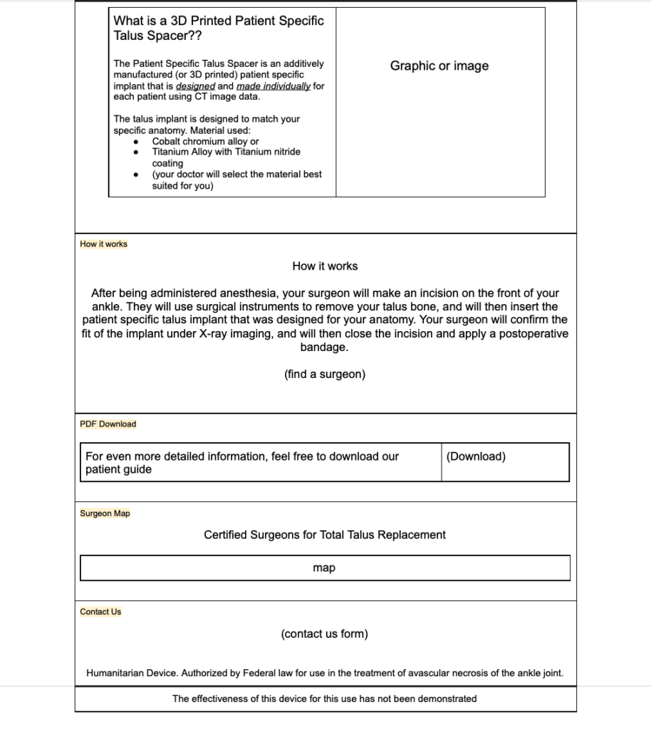
- A patient specific page to communicate information important to them
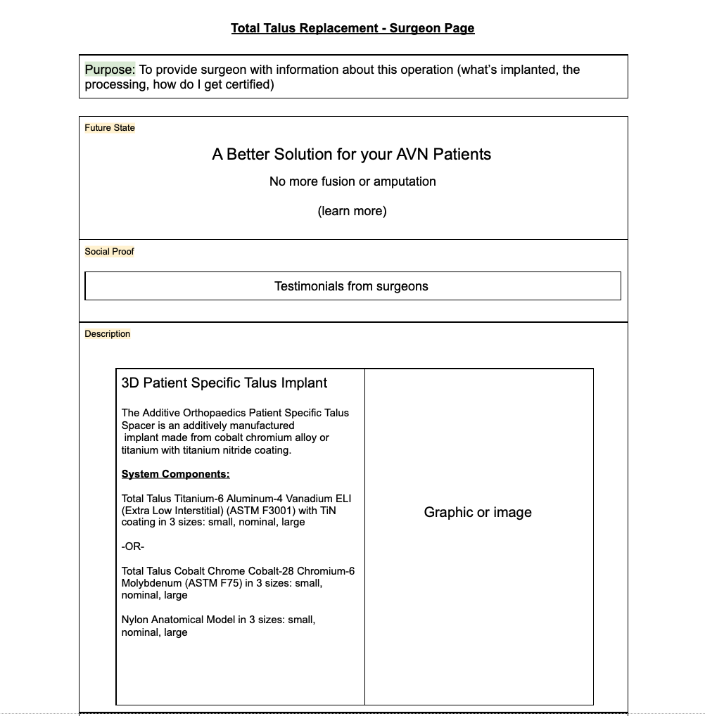
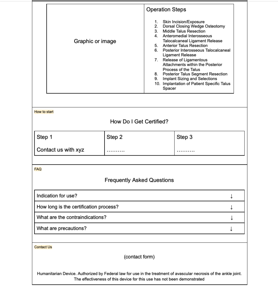
- A surgeon specific page to communicate information important them
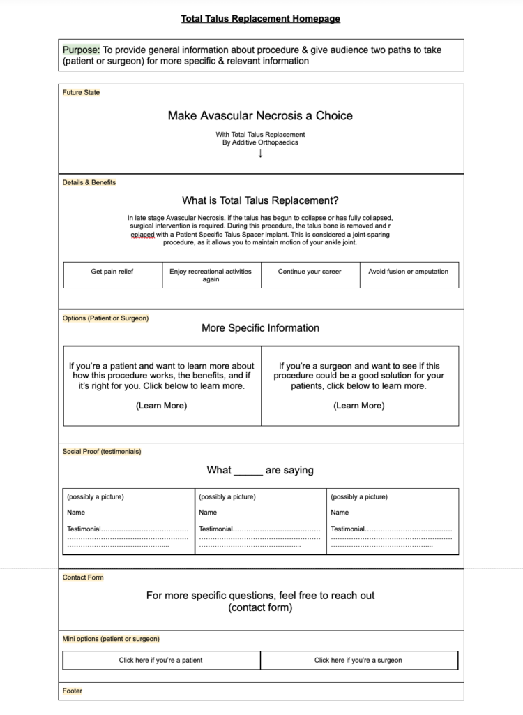
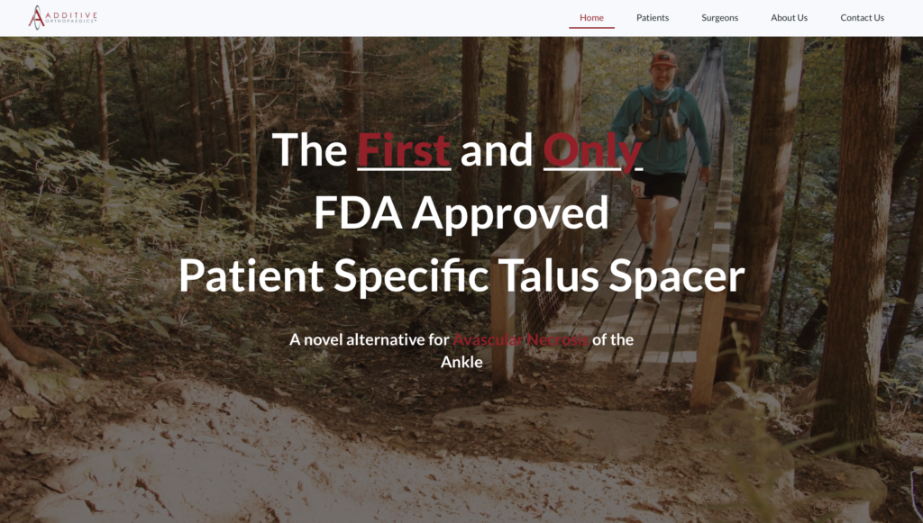
- A homepage that has general info but quickly directs the user to their intended page
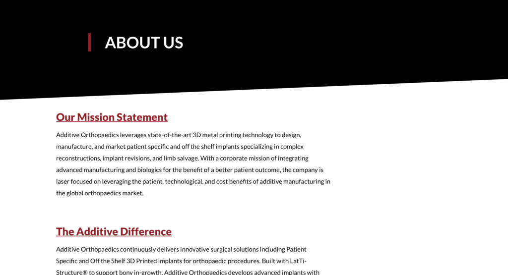
- An about us page to help users emotionally connect with the brand to build trust
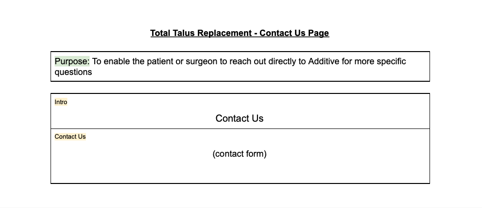
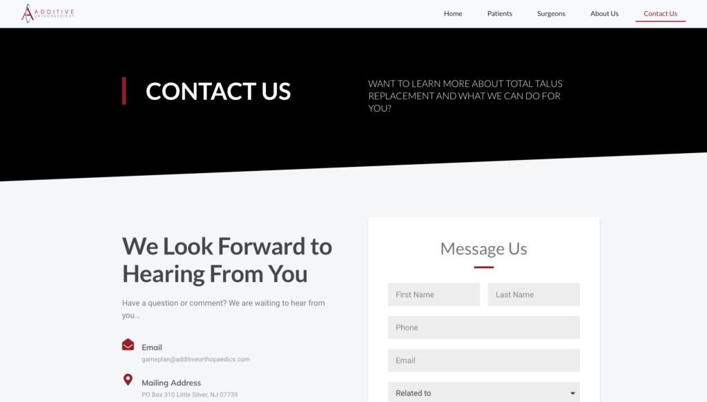
- A contact us page since the purpose is to get surgeons to sign up for certification
Propose the solution
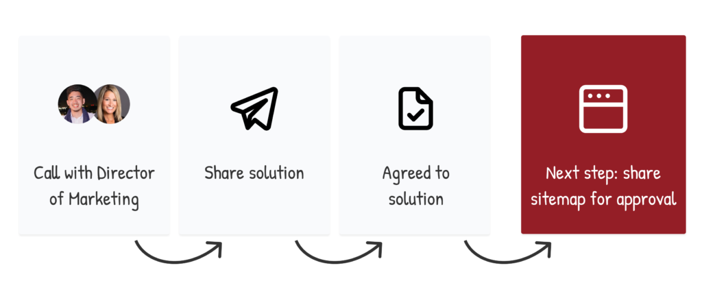
I had another call with the Director of marketing to propose the idea of 5 pages and reasoning behind building the site like this.
Basically I said if she agreed to this outline, then the next step would be to create a sitemap/wireframe of the pages, the information they would communicate, and touch base on any changes before developing the site.
She agreed and said it made sense to do it like this.
User flow
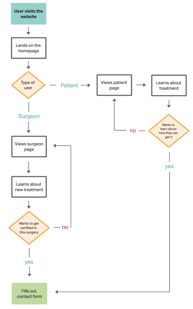
Making a sitemap
I asked the Director of Marketing to provide me with some general information to help me chronologically order the information on the sitemap.
I also asked to get connected with some team members who I could request relevant information from later during the development stages.
-
- The CAD Engineer so I can request 3D implant images
- Researchers as well to get information from studies that were done with the product
Patients Page
Reasoning on layout: I’ve learned that people use and buy products because they simply perceive it will improve their life in some way.
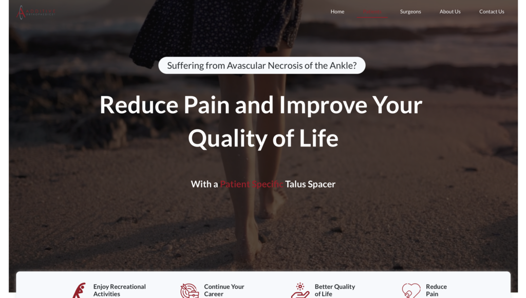
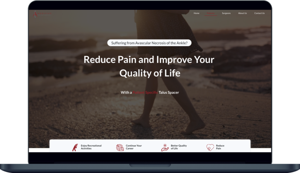
With that being said, whenever I make a landing page for a product, I start with a “future state”, so the user knows what their life will look like with this product.
In this case with the patient, they are suffering from pain because of their ankle disease. The future state in the wireframe is “walk without ankle pain”. (However it changes in the site)
Additionally, the details portion of this page was inspired by WebMD. The goal was to inform the patient with the answers they’re looking for.
Usually people refer to sites such as WebMD for answers to their injuries or when they’re sick.
Surgeon Page
Reasoning: The future state changes depending on the end user and what they care about.
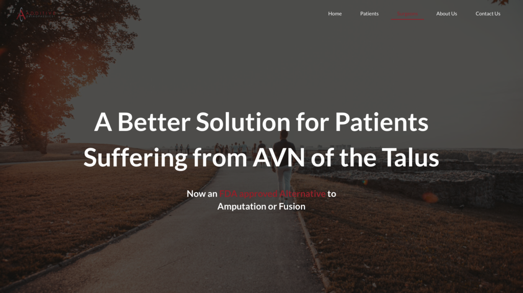
Rather than “walk without ankle pain” which would resonate with patients more, I decided to use “A better solution for your AVN patients, no more fusion or amputation” as the future state here.
It’s likely not a fun time for doctors to share with their patients that their options to get better are amputation or bone fusion.
In the informative section, the Director of Marketing shared with me the relevant information surgeons usually look for from her conversations with surgeons that Additive works with.
Homepage
Reasoning: There are two sections on the homepage that help end users navigate to their respective pages.
The first call to action to help patients and surgeons comes right after a brief description about what the site is about.
The second call to action comes right after the testimonials section that was built in to help build trust for both patients and surgeons.
Contact Us Page
Reasoning: There is a contact us form placed at the bottom of every page on the website since the goal is to have end users reach out about the new alternative treatment (whether they are a patient or surgeon).
Keeping in mind that not all users scroll to the bottom of the page and that they might look for way to contact the company in the navigation bar, I decided we’ll simply have a contact us page with the form as well for these situations.
About Us Page
Reasoning: Showing the more personal side of the company, the reason behind their mission helps patients and surgeons see that these efforts are made by humans and that we’re not just another medical company.
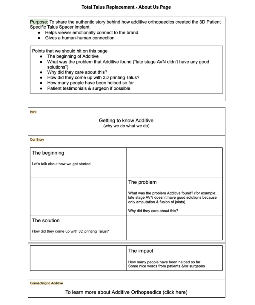
To share the authentic story behind how additive orthopaedics created the 3D Patient Specific Talus Spacer implant (helps viewer emotionally connect to brand)
Design & Develop Phase 1
The Director of Marketing approved the wireframe and I got started on designing & developing the site. In this case I’m the designer and the developer.
The people I worked with during this project were the CAD engineer and the Director of Marketing.
CAD Engineer
I wanted to communicate some cool parts about the process of creating the 3D implants such as the machine laser printing machine they use, and the tools that are sent to the surgeon during surgery.
Although I did get these 3D images from the CAD Engineer, we ended up focusing on just showing the implant itself to keep it concise.
Director of Marketing
I worked closely with the director as I completed each page to keep her in the loop of the site progress. Since the timeline to launch was a short time frame, I wanted to make sure if there were any changes, that they could be made right away as we built the pages.
Researcher
I requested for the director to get the clinical research information from the research team so that we could provide this on the surgeon page.
Legal/Regulatory Team
After the first draft of the site was up, the legal/regulatory team reviewed the website and provided copy changes.
There were a few unexpected things that came up.
1. The contact form was not working properly. The leads were failing to be sent to the business email and end users were also not receiving a confirmation email.
2. The layout on the wireframe/sitemap for the description section for both patient and surgeon page turned out to visually not work because there was too much text.
How I resolved the issue:
1. I set up and configured SMTP (Simply mail transfer protocol)
2. Instead of having an image to text and text to image layout, I used a format similar to this page in order deliver the large amount of informational text in a more user friendly way.
Design & Develop Phase 2
The red color throughout the site was taken from the brand color in Additive Orthopaedic's logo.
To enhance the future state messages above the fold for each page (homepage, patient page, surgeon page), I decided to use video backgrounds of people enjoying actively to help the end user imaging what their own lives can look like after they receive treatment.
Business Impact
Increased users from 0 to 33 patients using the newly FDA approved surgery
Built a consistent monthly website traffic of 50-75 visitors in the first 3 months
Explore more
